



Vanity metrics mislead marketers because they look like proof of progress without proving anything caused that progress or telling you what to do next. A follower count going up, a pageview spike, an open rate ticking higher: none of it tells you whether revenue moved. Here’s what to do about it this week.
Stop reporting the vanity number as if it were a KPI. Pull it off the dashboard slide you send leadership, even if it stays in a tactical channel report. Second, run a quick causality check: a small holdout group, a before/after comparison, or a look at conversion rate instead of raw volume. Third, swap the vanity metric for a single outcome KPI tied to revenue, retention, or cost, something like customer acquisition cost (CAC), incremental revenue, or return on ad spend (ROAS).
The rest of this piece walks through why vanity metrics fail, which ones marketers cling to most, and the measurement methods (MMM, incrementality testing, A/B tests, multi-touch attribution) that actually separate correlation from cause. If you manage a budget you have to defend in front of finance, this is the playbook.
Key Takeaways
Vanity metrics mislead marketers because they show activity without proving causality, and fixing that requires swapping counts for outcome-linked KPIs backed by real experiments.
| Point | Details |
|---|---|
| Run the three-question test | Ask if a metric is actionable, reproducible, and tied to a real outcome before reporting it. |
| Swap counts for rates and revenue | Replace followers, pageviews, and opens with engaged reach, conversion rate, and revenue per visit. |
| Use the measurement trifecta | Combine MMM, incrementality testing, and MTA, the approach 46% of marketing leaders already use. |
| Rebuild dashboards around one north star | Lead leadership reports with incremental revenue or margin-aware ROAS, not raw traffic numbers. |
| Use connected tools to enforce the fix | Platforms like Derail Logic’s Campaign Studio and AI Engine tie experiment orchestration and anomaly detection directly to execution. |
Table of Contents
- What Are Vanity Metrics, and How Do You Spot One?
- How Do Vanity Metrics Mislead Marketers?
- Which Common Metrics Should You Replace, and With What?
- How Do You Build a KPI Framework That Ties to Revenue?
- What Measurement Methods Actually Prove Causality?
- How Should Leadership-Ready Dashboards Look?
- How Do You Push Back When Someone Demands a Vanity Metric?
- What Do High-Performing Marketing Teams Actually Do Differently?
- What Would I Fix in a Typical Dashboard This Week?
- How Derail Logic Helps You Replace Vanity Metrics With Real Proof
- Sources
- FAQ
What Are Vanity Metrics, and How Do You Spot One?
A vanity metric is any number that looks impressive on a slide but doesn’t reliably inform a decision, prove causality, or connect to a business outcome. Follower counts, raw pageviews, and email opens all fall into this bucket most of the time, not because the numbers are fake, but because they don’t tell you what to do next.
John Cutler’s research at Amplitude frames the core problem as three overlapping failures: vanity metrics often lack context, carry unclear intent, and don’t guide action or learning. A number without those three things is just noise dressed up as a data point.
Here’s the test Derail Logic’s own analysts run on every metric before it goes into a client report:
- Can we act on it? If the number moves, is there a specific decision you’d make differently?
- Can we reproduce it? Would the same input produce the same result again, or was it a one-time fluke (a viral post, a holiday spike)?
- Does it reflect a real business outcome? Does it connect to revenue, retention, cost, or profit, even indirectly?
If a metric fails even one of those three questions, treat it with suspicion. The uncomfortable part: almost any metric can become a vanity metric depending on how it’s reported. Conversion rate is a genuinely useful number, but reported without sample size or segment context, it can mislead just as easily as a follower count. Intent and context turn a number into information. Their absence turns it into decoration.
How Do Vanity Metrics Mislead Marketers?
Vanity metrics don’t fail randomly. They fail in five specific, repeatable ways, and once you can name the failure mode, you can catch it before it drives a bad budget decision.
- Lack of causality. A metric rises, and everyone assumes the campaign caused it, but plenty of other things move at the same time (seasonality, competitor activity, a product launch elsewhere in the business). Teams that skip a causality check often pour more budget into a channel that was never actually driving the outcome. HBS Online’s guide to marketing effectiveness puts it plainly: measurement only matters if it connects spend to results, not just spend to activity.
- Lack of context. A 20% jump in email opens sounds great until you learn the list shrank by half. Numbers reported without a denominator, a baseline, or a segment breakdown routinely get celebrated for the wrong reasons.
- Manipulability. Followers can be bought. Pageviews can be inflated with clickbait headlines that hurt brand trust. Any metric that can be gamed cheaply will eventually get gamed, sometimes by an agency trying to look good in a monthly report.
- Focus on quantity over quality. Ten thousand app downloads mean little if 9,500 of those users never open the app again. Chasing volume metrics pulls budget toward tactics that generate noise instead of paying customers.
- Misaligned time horizon. Some metrics reward short-term spikes that damage long-term brand equity. A viral giveaway can crush your follower count in a week and attract an audience that never converts, ever.
Each failure mode has a direct fix, and they all point toward the same idea: the fix is proving cause and effect instead of assuming it. That’s what the measurement methods section below covers, specifically the measurement trifecta of MMM, incrementality testing, and MTA that BCG found separates leading marketing teams from everyone else.
Which Common Metrics Should You Replace, and With What?
Marketers keep reporting certain numbers out of habit, not because they’re useful. Below is the direct swap for the offenders that show up most often, and what changes once you make the switch.
- Follower counts → engaged reach that leads to conversion. A brand with 50,000 followers and a 0.3% engagement rate is worse off than one with 8,000 followers and a loyal, purchasing audience. Tracking engaged reach instead of raw followers reallocates content budget away from growth hacks and toward retention content.
- Pageviews → conversion rate or revenue per visit. A landing page with 100,000 monthly visits and a 0.4% conversion rate is underperforming a page with 10,000 visits and a 4% conversion rate, even though the first page looks better in a traffic report. Once a team switches to revenue per visit, budget usually moves from top-of-funnel traffic buys into page optimization.
- App downloads → activated users or day-30 retention. A spike in downloads after a paid push means nothing if most users churn in week one. Measuring day-30 retention instead of install count changes how a mobile team prioritizes onboarding fixes over acquisition spend.
- Email opens → click-to-conversion rate. Open rates got noisier after Apple’s Mail Privacy Protection started pre-fetching images, inflating opens artificially. Shifting to click-to-conversion gives a cleaner read on which subject lines and offers actually move people.
- Impressions → cost per incremental conversion. Impressions tell you reach, not impact. Pairing impressions with an incrementality read tells you whether the ad spend created a sale that wouldn’t have happened anyway.
- Total sign-ups → customer lifetime value (CLV) or activation rate. A lead-gen form that produces thousands of sign-ups but few paying customers is a vanity win. Shopify’s guidance on effectiveness measurement recommends anchoring acquisition reporting to new-customer ROAS (NC ROAS) instead of raw sign-up volume, specifically because it isolates first-time buyers rather than counting repeat customers as new growth.
The pattern across every swap: replace a count with a rate, and replace a rate with an outcome tied to money. That’s the shortest path from a number that impresses to a number that decides something.
How Do You Build a KPI Framework That Ties to Revenue?
A KPI framework that survives a budget review starts with one north star and ladders everything else underneath it. Here’s the sequence Derail Logic recommends to marketing teams building their first outcome-linked reporting structure.
- Pick one or two north-star KPIs tied directly to business outcomes. Revenue, incremental revenue, or net-new customer value work better than a blended metric that tries to capture everything at once.
- Map supporting input metrics to that outcome. Conversion rate, CAC, and CLV should each explain part of how the north star moves, not compete with it for attention.
- Set thresholds and guardrails, not just targets. A CAC target without a payback-period guardrail invites a team to hit the number by cutting corners on lead quality.
- Define a review cadence. Weekly for tactical inputs, monthly for CAC and conversion trends, quarterly for anything tied to lifetime value.
- Watch for Goodhart’s Law. Once a metric becomes a target, people find ways to hit it that don’t serve the underlying goal. Rotate which input metrics get scrutiny so no single number becomes the whole game.
Here’s how that framework plays out across a few common business models:
- Ecommerce: North star is incremental revenue or NC ROAS. Inputs worth watching: conversion rate, average order value, repeat purchase rate.
- SaaS: North star is net revenue retention or activated trial-to-paid conversion. Inputs worth watching: CAC payback period, feature adoption rate, churn by cohort.
- Lead-gen: North star is cost per qualified opportunity or closed-won revenue. Inputs worth watching: lead-to-opportunity rate, sales cycle length, marketing-sourced pipeline.
For teams still deciding which metrics belong at each funnel stage, a broader breakdown of analytics metric categories can help clarify where inputs stop and outcomes start.
What Measurement Methods Actually Prove Causality?
Proving a campaign caused a result, rather than just correlating with it, takes one of four methods, and each answers a different question.
Marketing Mix Modeling (MMM) uses historical spend and outcome data across channels to estimate each channel’s contribution to revenue over time. It answers a strategic question: where should next quarter’s budget go? It doesn’t require individual-level tracking, which makes it privacy-resilient, but it needs months of clean historical data and doesn’t react quickly to a single campaign change.
Incrementality testing (holdouts) withholds a channel or tactic from a control group and compares outcomes against a group that received it. It answers the sharpest question of all: did this specific spend cause this specific result? It’s the closest thing marketing has to a clinical trial, but it takes planning, a large enough sample, and patience to run properly.
Randomized A/B testing compares two versions of a specific tactic (a subject line, a landing page, a creative) to see which performs better. It answers narrow, fast questions about optimization, not broad questions about channel-level strategy.
Multi-touch attribution (MTA) assigns fractional credit across touchpoints in a customer’s path to conversion. It answers a daily optimization question (which touchpoints are pulling their weight this week?) but it struggles with cross-device tracking and can’t prove causation the way a holdout can.
| Method | Speed | Causal strength | Data needs |
|---|---|---|---|
| MMM | Slow (monthly/quarterly) | Strong for strategy | Months of historical spend and outcome data |
| Incrementality testing | Medium (weeks) | Strongest, direct causal proof | Large enough audience to split into control/test |
| A/B testing | Fast (days to weeks) | Strong for narrow tactics | Sufficient traffic per variant |
| MTA | Fast (daily) | Weakest, correlational | Clean cross-channel tracking data |
BCG’s research on marketing measurement found that Some marketing leaders now use all three of MMM, incrementality testing, and MTA together, a combination researchers call the measurement trifecta. Among leading marketers, a notable portion run MMM refreshes more frequently than quarterly, giving them a faster read on shifting channel effectiveness.
- Start with MTA for daily optimization, since it’s already running if you have a tracking pixel installed.
- Layer in quarterly A/B tests on your highest-spend creative and landing pages.
- Run one incrementality holdout per major channel per year, and use the result to sanity-check what MTA and MMM are telling you.
- Build or license an MMM once you have at least a year of clean spend and outcome data across channels.
Pro Tip: Use your incrementality test results to calibrate your MMM’s coefficients. If the holdout says a channel drove less lift than MMM assumed, adjust the model’s weighting for that channel before trusting its next budget recommendation.
Platform-reported conversions deserve particular skepticism. Ad platforms tend to overstate the results they’re responsible for, which is one reason triangulating platform data against an independent method like incrementality testing matters more than it used to.
How Should Leadership-Ready Dashboards Look?
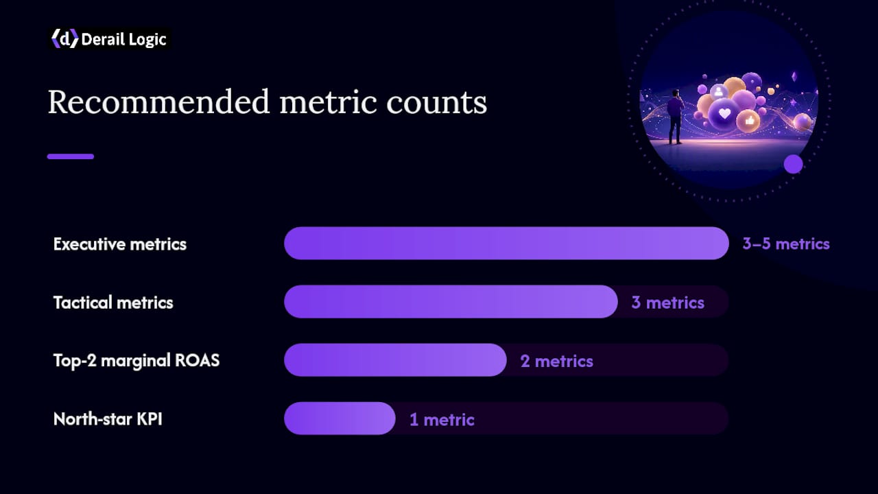
A dashboard built for a CEO or CFO should never lead with a vanity number, and it should never bury the metric that matters under five that don’t.
- Put one north-star KPI at the top, framed as a dollar figure or a rate tied to revenue, not a raw count.
- Show a top-line financial signal (revenue, incremental revenue, or margin) next to it, so context is immediate.
- Report margin-aware ROAS, not blended ROAS, since blended numbers hide unprofitable channels behind profitable ones.
- Include marginal ROAS for your top two spend channels, since the return on your next dollar is rarely what your average return implies.
- Add a conversion funnel view with confidence bands from your A/B tests, so leadership sees uncertainty instead of false precision.
What the CEO sees and what a channel manager sees should differ. The executive dashboard needs three to five numbers tied to revenue and cost. The tactical dashboard, the one a paid social manager checks daily, can keep click-through rate, cost per click, and engagement metrics, because those numbers still guide day-to-day optimization even though they don’t belong in a board deck.
Governance matters here too. Assign one owner who can change a KPI’s definition, document every measurement caveat next to the number it applies to (sample size, attribution model used, date range), and revisit those definitions on a fixed schedule instead of letting each team quietly redefine “engagement” to suit their monthly report. Teams looking for a starting structure can borrow from ready-to-use reporting templates built around this exact hierarchy.
How Do You Push Back When Someone Demands a Vanity Metric?
Every marketer eventually sits across from a CMO, CFO, or agency partner who wants the big, flattering number instead of the smaller, honest one. Knowing the red flags and having a script ready makes that conversation shorter and more productive.
Watch for these warning signs before a decision gets made on bad data:
- A single-month spike gets celebrated without a conversion check. If nobody asks “did this turn into revenue,” that’s the moment to ask it yourself.
- Platform-reported conversions are treated as the only proof of performance, with no independent test or holdout to confirm them.
- A metric changes definition between reports, and no one flags the change or explains why the trend line jumped.
Here are three short scripts for the moments those red flags show up in a meeting:
With a CMO: “That follower growth is real, but before we shift budget toward it, can we run a two-week holdout on this channel? It’ll tell us whether the growth is converting or just accumulating.”
With a CFO: “I hear the concern about spend efficiency. Instead of leading with ROAS alone, let’s look at incremental revenue from our last holdout test, since that’s the number that maps directly to the P&L.”
With an agency partner: “We’re not going to report platform-attributed conversions as the primary success metric anymore. Can you send us the raw conversion data so we can triangulate it against our own tracking?”
When a measurement gap is bigger than a single meeting can fix, escalate it. Ask finance or a data team for a minimum viable experiment, even a small one, rather than accepting another quarter of numbers nobody can act on.
What Do High-Performing Marketing Teams Actually Do Differently?
The gap between teams that measure well and teams that don’t isn’t budget size. It’s structure. BCG’s research shows the 46% of marketers using the full trifecta (MMM, incrementality testing, and MTA together) consistently outperform teams relying on a single method, largely because each method covers the others’ blind spots.

| Practice | Leading teams | Typical teams |
|---|---|---|
| MMM refresh cadence | Monthly | Quarterly or annually |
| Incrementality testing | Ongoing per major channel | Rare or one-off |
| MTA usage | Daily tactical optimization | Sole source of attribution truth |
| Leadership reporting | Outcome KPIs with confidence bands | Channel-level vanity metrics |
Ownership matters as much as cadence. Resourcing that works in practice usually looks like this:
- A senior analyst or data science hire owns the MMM build and its quarterly recalibration.
- A performance marketing lead runs day-to-day MTA and channel optimization, understanding its limits going in.
- Experiments (A/B tests and incrementality holdouts) live with whichever team owns the channel being tested, but results get reviewed centrally so no team can quietly ignore an unfavorable holdout.
The credibility stakes are real. AdExchanger’s reporting found that fewer than two-thirds of major companies still maintain a Chief Marketing Officer or equivalent role, and the decline tracks partly to marketing teams reporting metrics that never connected to revenue. A balanced approach, per HBS Online’s research, pairs quantitative KPIs like CAC and CLV with qualitative judgment about brand equity, since chasing short-term efficiency alone can quietly erode long-term growth.
What Would I Fix in a Typical Dashboard This Week?
Most marketing dashboards I’ve seen have the same problem: they were built to make last quarter look good, not to help someone decide what to do next quarter. A 30/60/90 plan fixes that without requiring a full measurement rebuild on day one.
In the first 30 days, remove every vanity KPI from the leadership deck, even if the tactical team still tracks it internally. Replace the top-line slide with one north-star KPI and its trend line, nothing else competing for attention at the top.
By day 60, run at least one small holdout test on your highest-spend channel. It doesn’t need to be perfect. A two-week test with a modest control group tells you more than another quarter of platform-reported conversions.
By day 90, put a cadence in place: MMM refreshed monthly if you have the data history for it, incrementality tests scheduled per channel over the year, and a documented owner for each. That’s the structural shift that turns measurement from a one-time cleanup into a habit.
Picture the before and after. Before: a dashboard led with follower growth, total impressions, and email open rate, three numbers that made the quarter look busy. After: the same dashboard leads with incremental revenue, margin-aware ROAS, and a confidence band from the latest A/B test, three numbers that tell you whether to spend more or pull back. Success on the 90-day plan isn’t a prettier dashboard. It’s a budget conversation where nobody has to guess whether last quarter’s spend actually worked. For dashboard structure ideas that fit this exact rebuild, integrated dashboard examples are worth a look.
How Derail Logic Helps You Replace Vanity Metrics With Real Proof
Derail Logic is built for the exact gap this article describes: the space between a metric that looks good and a metric that proves something. Its Campaign Studio lets you orchestrate a holdout or A/B test alongside the campaigns it’s measuring, instead of running experiments in a separate tool disconnected from execution.

The AI Engine pulls from eight live data sources to flag anomalies before they distort a report, catching the kind of single-month spike that gets celebrated in a meeting before anyone checks whether it converted. Autopilot surfaces those opportunities and risks proactively, so a channel quietly underperforming on incremental revenue doesn’t hide behind a healthy impressions count for another quarter. Together, these features move a team’s dashboard from counting activity to proving impact, which is the entire argument of this article in product form.
If your reporting still leans on the metrics covered above, start by exploring Derail Logic’s marketing automation to see how connected campaign execution and measurement can replace the vanity numbers on your next leadership deck.
Sources
- Six steps to more effective marketing measurement | BCG
- What Are Vanity Metrics and How to Stop Using Them – John Cutler | Amplitude
- How to measure marketing effectiveness: Metrics, methods, and what actually works | Formula
- Marketing effectiveness measurement | Shopify
FAQ
Why are vanity metrics unlikely to reveal meaningful business insights?
They fail because they don’t prove causality, can be manipulated cheaply, and often reward short-term spikes over sustainable growth, so a rising number doesn’t mean the underlying business improved.
What are vanity metrics in marketing?
Vanity metrics are counts or rates, like followers, pageviews, or email opens, that look impressive but don’t reliably guide a decision or connect to revenue.
Which KPI is most likely to be a vanity metric?
Raw follower counts and total impressions are the most common offenders, since both measure exposure without confirming any downstream action or purchase.
What is the difference between actionable and vanity metrics?
An actionable metric passes the test of being usable, reproducible, and tied to a real outcome, while a vanity metric fails at least one of those three checks, most often the link to a business result.
Are vanity metrics ever useful?
They can serve as directional signals for brand awareness or content reach, but they should never anchor a budget decision without a causal test like incrementality testing or an A/B experiment behind them.