



Consistent visual identity drives faster brand recognition, stronger customer trust, and measurable revenue gains, and it does this by removing friction everywhere a customer encounters your brand. Three reasons this lands on a marketer’s priority list this quarter:
- Recognition speed: shoppers process and recall consistent visual cues faster than mixed signals.
- Trust and credibility: inconsistent branding reads as sloppy or, worse, unsafe.
- Operational efficiency: fewer design errors, faster asset production, less rework.
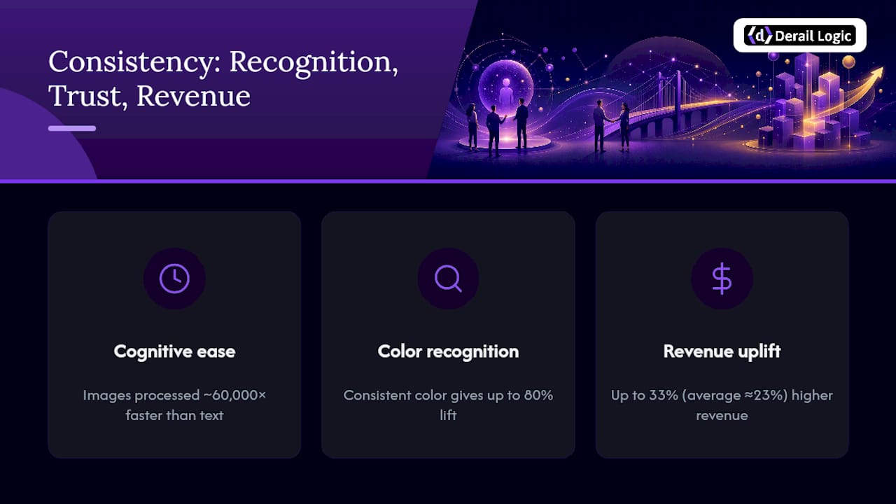
Consistent branding is tied to a 23% average revenue increase across companies that manage it well, and color consistency alone can lift brand recognition by up to 80%.
Key Takeaways
Consistent visual identity across platforms works because it speeds recognition, builds trust, and lifts measurable revenue when treated as an operational system rather than a design afterthought.
| Point | Details |
|---|---|
| Recognition compounds with consistency | Repeated color and logo use can lift brand recognition by up to 80%. |
| Consistency drives revenue | Highly consistent brands report gains as high as 33%, with other studies citing 23%. |
| Build tokens, not just guides | Encode color, spacing, and type into design tokens so identity survives across web, app, and dark mode. |
| Audit quarterly | Score every touchpoint against your visual standards and fix drift before the next campaign launch. |
| Centralize production with Derail Logic | Derail Logic’s visual campaign studio and AI image generation apply brand rules automatically across every campaign asset. |
Table of Contents
- Why Visual Identity Matters Across Platforms Versus Brand Identity
- How Does Consistent Visual Identity Drive Trust and Revenue?
- What Are the Core Elements of a Cross-Platform Visual Identity?
- How Do You Maintain Visual Consistency Across Platforms?
- Turning a Brand Guide Into a Usable Design System
- How Do You Audit Visual Identity Consistency?
- What Are the Most Common Visual Identity Mistakes?
- Adapting Visual Identity for International and Culturally Diverse Audiences
- How Do You Evolve Visual Identity Without Losing Recognition?
- Lessons Learned Scaling Visual Identity
- How MartechAI Keeps Your Visual Identity Consistent at Scale
- Sources
- FAQ
Why Visual Identity Matters Across Platforms Versus Brand Identity
Visual identity is the set of visible signals a company controls: its logo, color palette, typography, imagery style, icons, and motion patterns. It’s what a customer actually sees on your website, app, packaging, and social feed, the surface layer people react to before they read a single word.
Brand identity is the layer underneath. It covers your values, voice, positioning, and the promises you make to customers. A company can have crystal-clear values and still confuse buyers if its visible elements shift from channel to channel.
Here’s the distinction in practice:
- Brand identity answers “who are we and what do we stand for.”
- Visual identity answers “how do we look everywhere someone finds us.”
- A logo lockup, a specific shade of purple, a typeface pairing, and a photography style are all visual identity assets, not brand strategy documents.
Marketers who conflate the two end up with strategy decks nobody can execute, because a values statement doesn’t tell a designer what hex code to use in a dark-mode app icon. Treating visual identity as its own discipline, with its own deliverables, is what makes brand identity usable day to day.
How Does Consistent Visual Identity Drive Trust and Revenue?
Human brains process images roughly 60,000 times faster than text, which is why repeated visual cues, a specific color, a familiar logo shape, register before a customer reads a word of copy. That speed advantage compounds with exposure: the more consistently a mark appears, the less cognitive work a shopper does to recognize it next time.
Color does a disproportionate share of that work. Industry research puts the recognition lift from consistent color use at up to 80%, which is why brand teams guard their palette more tightly than almost any other asset.
Trust follows a similar logic in reverse. When a logo looks slightly different on Instagram than it does on the checkout page, most shoppers won’t consciously flag the discrepancy, but it registers as friction. Security researchers have long known that inconsistency is one of the signals people use, often unconsciously, to judge whether a site or app is legitimate. A mismatched visual identity raises perceived risk exactly when a purchase decision is on the line.
The revenue case backs this up. Companies with highly consistent branding report as much as 33% higher revenue than peers with fragmented visual presentation, and separate research puts the average uplift closer to 23%. Two different studies, two different numbers, but the direction is the same: consistency pays.
Real-world cases make the mechanism visible. Apple runs the same minimal visual grammar across its retail stores, packaging, and app icons, so a customer recognizes an Apple product from ten feet away without reading a word. Spotify’s dark green stayed anchored across its desktop app, mobile app, and dark-mode interface, proving a strong identity can flex for a display mode without losing its core signature.
What Are the Core Elements of a Cross-Platform Visual Identity?
A visual identity only survives multi-platform deployment if every component has been built to flex. Here’s what needs to be locked down before your team ships another campaign:
- Logo systems with responsive variants. A full lockup for a website header, a simplified mark for a mobile nav bar, and an icon-only version for app tiles and favicons. Define minimum pixel sizes for each surface, favicon, app icon, hero banner, out-of-home billboard, so nothing gets scaled into illegibility.
- Color systems built for dark mode and accessibility. Every brand color needs a documented hex value plus tested variants for dark backgrounds, and every text-on-color combination needs to clear WCAG contrast minimums. Skip this and your brand looks broken the moment a user flips their phone to dark mode.
- Typography with fallback stacks. Pick a primary typeface, a web-safe fallback, and optical sizing rules for small screens versus large displays. A headline font that looks sharp on a 27-inch monitor can turn illegible on a smartwatch notification.
- Photography and illustration direction. Document lighting, cropping, and subject-matter rules so a freelancer in one market produces images that match a staff photographer in another.
- Iconography. A consistent stroke weight and corner radius across icons keeps a settings menu and a marketing graphic feeling like the same product.
- Motion and micro-interaction rules. Define easing curves, transition durations, and loading-state animations, plus export specs (SVG, WebP, MP4) so motion assets render consistently across web and native apps.
How Do You Maintain Visual Consistency Across Platforms?
Consistency breaks down the moment more than one person touches a brand asset without a shared reference. The fix is treating identity as infrastructure, not a static PDF.
Start with a single source of truth. A cloud-based digital asset library with permission controls and version history means the current, approved logo file is always the one people find first, not a five-year-old copy buried in someone’s downloads folder.
From there, build a real design system. This means encoding your visual identity into design tokens, variables like color-brand-primary, spacing-unit-base, or radius-card, that developers and designers reference instead of eyeballing values from a screenshot. Tokens are what let a rebrand update propagate across a website, an app, and an email template by changing one file instead of a hundred.

Templates close the gap between system and output. Adopt one template per recurring format: one Instagram carousel template, one email header template, one paid-ad template. Practitioner guidance on social media branding backs this up directly, teams that standardize a template per format ship faster and drift less than teams designing every post from scratch.
Developer handoff matters just as much as design polish. Component libraries in tools like Figma, paired with a documented system in Storybook and version control in Git, keep engineering and design working from the same components instead of reverse-engineering screenshots.
Finally, someone has to own this. Assign a brand guardian role, set an approval workflow for new asset types, and run a consistency audit on a fixed cadence, quarterly works for most mid-size teams.
Pro Tip: Give your brand portal a “why” annotation next to every rule, not just the rule itself. “Use this blue, not that one” gets ignored. “Use this blue because it’s the only shade that passes WCAG contrast on our dark app background” gets followed.
Turning a Brand Guide Into a Usable Design System
The gap between a polished PDF brand guide and a system a developer can actually implement is where most consistency efforts quietly die. A style guide that lives as a static document gets skimmed once and forgotten; a token set that lives inside your codebase gets used every single build.
Translating a brand guide into tokens means someone sits down and converts every visual rule, colors, spacing, type scale, corner radii, into named variables stored in a version-controlled repository, not a slide deck. That token set needs dark-mode variants and documented WCAG contrast values baked in from day one, because retrofitting accessibility after launch costs far more than building it in.
This is exactly the operational gap Derail Logic’s visual campaign studio is built to close. Instead of designers rebuilding the same branded template from scratch for every campaign, teams can generate on-brand assets, social graphics, ad creative, email headers, directly from a centralized brand profile, with logo placement and color rules applied automatically rather than reconstructed by hand each time.
A governance checklist keeps the system alive after launch:
- Assign clear ownership of the token set and brand portal.
- Require version control on every asset update, no silent overwrites.
- Schedule a recurring audit, quarterly at minimum, to catch drift before it spreads.
- Require new vendors and freelancers to pull assets from the portal, never from an old email attachment.
The teams that keep their visual identity intact past year two aren’t the ones with the prettiest brand guide. They’re the ones who turned that guide into infrastructure someone is accountable for maintaining.
How Do You Audit Visual Identity Consistency?
A quarterly audit doesn’t need to be elaborate to catch drift early. Walk through every major touchpoint, website, social profiles, paid ads, email templates, packaging, and score each one against your locked visual standards.
- Pull current assets from each channel and compare logo, color, and type usage against your token set.
- Score each touchpoint on a simple scale, fully compliant, minor drift, or non-compliant.
- Flag and fix anything scoring below “minor drift” before the next campaign launch.
Pair the audit with a handful of KPIs that actually move the needle:
| KPI | What It Measures |
|---|---|
| Recognition testing | Whether target customers identify your brand from a partial logo or color swatch alone |
| Brand lift studies | Aided and unaided recall before and after a consistency push |
| Engagement signals | Click-through and time-on-page differences between consistent versus inconsistent campaign assets |
| Qualitative mentions | Social listening for comments about brand feel, trust, or confusion |
A score below “minor drift” on more than one touchpoint is your cue to escalate the fix into next sprint’s roadmap, not next quarter’s.
What Are the Most Common Visual Identity Mistakes?
Most consistency failures trace back to a handful of repeat offenders, and each one has a fast fix.
- A PDF brand guide nobody opens. Migrate it into a living portal with ready-to-use templates instead of static pages.
- Social posts that look like five different brands. Build one template per recurring format and enforce brand kit use for every post.
- Accessibility and dark mode treated as an afterthought. Add WCAG contrast checks and dark-mode token variants before launch, not after complaints roll in.
- Freelancers and vendors using outdated logo files. Require brand-portal access and pre-approved templates for every external contributor, no exceptions.
Adapting Visual Identity for International and Culturally Diverse Audiences
A visual identity that works in one market can misfire in another, and the fix is rarely a full redesign. Color carries different meaning across cultures: red signals luck and celebration in China but caution or danger in much of the West. A palette chosen without that context risks sending the wrong emotional signal the moment a brand expands.

Adaptive identity systems handle this better than rigid ones. Rather than forcing an identical visual package into every market, platform-appropriate adaptation outperforms strict 1:1 mirroring because it reduces the visual friction a local audience feels when a design clearly wasn’t built with them in mind. The core mark, the logo shape, the typographic personality, stays fixed. Secondary elements, supporting color accents, photography subjects, iconography style, flex to fit local context.
Typography needs the same flexibility. A Latin-script wordmark rarely translates cleanly into Arabic, Mandarin, or Hindi typesetting, so international brands need a documented secondary type system for non-Latin markets rather than a forced substitution that breaks the brand’s visual rhythm.
Imagery deserves the same scrutiny. Stock photography that reads as aspirational in one region can feel foreign or tone-deaf in another. Build a documented photography brief with enough flexibility for regional teams to source locally relevant imagery while still following the same lighting and composition rules.
The goal isn’t uniform sameness. It’s what practitioners call perceptual consistency, a customer in São Paulo and a customer in Seoul both instantly recognize the brand, even though the specific assets in front of them aren’t identical.
How Do You Evolve Visual Identity Without Losing Recognition?
Every strong visual identity needs to evolve, static brands look dated fast, but the update has to protect what customers already recognize. The safest approach is evolution, not revolution: change one or two elements at a time rather than overhauling logo, color, and type simultaneously.
Spotify’s own dark-mode rollout is a useful reference point. Its interface shifted dramatically for dark mode, but the brand’s signature green and wordmark stayed anchored, so long-time users never lost the thread of recognition even as the surrounding visual context changed.
Before rolling out any update, test it against your existing recognition baseline. If a redesigned logo scores meaningfully lower on unaided recall than the version it’s replacing, that’s a signal to phase the rollout rather than flip the switch across every channel at once.
Document every legacy asset before retiring it. Keep old lockups, color codes, and templates archived with version notes, not deleted, so historical marketing materials and case studies remain traceable. Communicate the change internally before it goes external: sales teams, customer support, and partners should never be caught explaining a new look they’ve never seen.
Finally, budget for a transition period. Running old and new assets in parallel for a defined window, typically one to two quarters, gives customers time to adjust without a jarring overnight switch that reads as inconsistency rather than intentional evolution.
Lessons Learned Scaling Visual Identity
The biggest lift I’ve seen come from one unglamorous change: moving a brand guide out of a PDF and into a living portal with real templates. Teams that make that switch stop reinventing assets from scratch and start shipping faster, with fewer off-brand mistakes slipping through.
How MartechAI Keeps Your Visual Identity Consistent at Scale
Derail Logic gives marketing teams a centralized way to keep every campaign on-brand without hiring a dedicated production team for every channel. Instead of designers rebuilding the same asset five different ways for web, social, and email, the platform’s visual campaign studio pulls from one branded profile so logo placement, color tokens, and typography stay locked no matter which format you’re producing for.
The AI-driven image generation feature applies your brand’s visual rules automatically, including subtle, consistent logo placement, so a marketing team of three can produce the campaign output of a team five times its size. Paired with creative design services for heavier lifts, and campaign studio templates that enforce one format per recurring asset type, teams stop losing hours to rebuilding the same graphic from scratch every week.
If your team is still managing brand assets across scattered folders and inconsistent templates, start a trial of Derail Logic’s marketing automation platform and see how much production time a centralized visual system actually saves.
Sources
- Visual Identity Guide (2026): Build a System, Not Just a Logo
- Omnichannel Branding: Why Uniformity Is Killing Your Brand
FAQ
Why does visual identity matter across platforms?
Consistent visual identity speeds up recognition, builds trust, and correlates with revenue gains as high as 33% for companies that manage it well.
What’s the difference between visual identity and brand identity?
Visual identity covers the visible elements, logo, color, typography, imagery, while brand identity covers the underlying values, voice, and positioning those visuals represent.
What are design tokens and why do they matter for branding?
Design tokens are named variables, like a specific hex code or spacing unit, that encode visual identity rules directly into a codebase so they stay consistent across every platform automatically.
How often should a brand audit its visual consistency?
Most mid-size teams run a full touchpoint audit quarterly, checking website, social, ads, email, and packaging against their locked visual standards.
Can Derail Logic help maintain visual identity across campaigns?
Derail Logic’s visual campaign studio and AI-driven image generation apply a brand’s color, logo, and typography rules automatically across campaign assets, reducing the manual rework that causes visual drift.