



Reduce perceived effort, build mobile-first with a single column, and pair correct input types with inline validation: these three moves account for most of the conversion gain available on any landing page form. Start by testing tactical wins first: drop the password field until after conversion, turn on browser autocomplete, and add a short privacy line next to the submit button.
TL;DR:
- Removing password fields and optimizing input types with inline validation can significantly boost form conversion rates on mobile devices.
- Keeping forms to two or three steps with clear progress indicators generally outperforms longer, single-step flows for larger data collection.
- Prioritizing speed improvements and reducing friction fields has a greater impact on abandonment than cosmetic layout changes or multi-step structures.
- Asking only essential questions upfront, and deferring optional data, makes forms easier and quicker to complete, especially when ordered from easiest to hardest.
- Implementing basic accessibility best practices, like properly linking labels and inputs, improves usability for all users without requiring design overhaul.
Table of Contents
- Core design principles for landing-page forms
- Field selection, sequencing, and microcopy that reduce friction
- Single-step vs multi-step: rules for choosing and running tests
- Mobile and performance optimizations that move the needle
- Accessibility, validation, and security practices
- Practical examples and microcopy patterns to test
- How integrated analytics speed up form improvement
- Common traps, confident tests, and what to ignore
- How MartechAI helps you build and test better forms
- Primary sources and further reading
- Sources
- FAQ
Core design principles for landing-page forms
Every high-performing form follows the same handful of rules, and they hold whether you’re collecting three fields or ten. The starting point is layout: a single-column vertical flow keeps the eye moving down the page instead of jumping between columns, which is why Nielsen Norman Group recommends single-column layouts as a default for web forms.
From there, the details matter as much as the structure.
- Show labels above each field rather than inside it, since placeholder-only labels disappear once someone starts typing and force them to remember what was asked.
- Minimize perceived effort by inferring values where you can, deferring optional fields to a later step, and removing anything that feels like a burden, such as a password field on first contact.
- Write CTA copy that names the outcome (“Get my audit” beats “Submit”) and place a short trust line, like a privacy note or a security badge, right next to the button.
- Group related fields visually so the form reads as a short sequence of decisions rather than a wall of inputs.
Baymard’s form-design guidance backs this up directly: single-column layouts and tighter grouping reduce cognitive load and cut abandonment, especially on longer flows.
Field selection, sequencing, and microcopy that reduce friction
The fastest way to lower abandonment is to ask for less, and to ask for it in the right order. Every field you add is a small tax on the reader’s patience, so each one needs to earn its place.
- Ask only what qualifies or routes the lead right now: name, work email, and maybe company size are usually enough at the top of the funnel.
- Push everything else, job title, budget, use case, into onboarding or progressive profiling once the relationship has started.
- Order fields from easiest to hardest, and put the questions most people can answer instantly first, since early momentum carries readers through the harder ones.
- Combine fields when it reduces steps without losing data, such as a single “full name” input instead of separate first and last name boxes, unless your CRM genuinely needs them split.
- Write microcopy that removes doubt: a short privacy line (“We never share your email”), a format hint under phone fields, and an “(optional)” label on anything not required.
Baymard Institute’s checkout usability research found that a typical checkout carries around 23.48 form elements when the ideal flow needs closer to 12, and that cutting visible elements by 20% to 60% is commonly achievable without losing the data that matters.
Single-step vs multi-step: rules for choosing and running tests
The honest answer is that neither format wins by default. A form with five or more required fields tends to benefit from being split into steps, while anything shorter usually performs better as one continuous form, since splitting it just adds friction for no reason.
- Open the first step with the easiest possible question, something almost anyone can answer without thinking.
- Show a visible progress indicator so the reader knows how much is left.
- Keep the total to two or three steps; more than that and drop-off tends to creep back in.
- Always allow back navigation so a mistake doesn’t force someone to start over.
Black Propeller’s 2026 synthesis of landing page benchmarking is a useful check here: it found that many quoted lift numbers for multi-step forms lack a traceable methodology, so treat any specific percentage as directional rather than a guarantee for your own audience.
Pro Tip: Change one variable at a time, either the step structure or a field, never both, so field-level analytics can tell you which move actually moved the number.

Mobile and performance optimizations that move the needle
Most landing page traffic now arrives on a phone, and small technical choices decide whether that visitor finishes the form or gives up mid-tap.
- Keep the single-column layout on mobile and set correct
inputmodeandautocompleteattributes so the right keyboard appears and browsers can fill in known data automatically. - Where a password step is unavoidable, offer passkeys or browser-based autofill instead of forcing a new one to be typed on a small screen.
- Set tap targets to at least 48 pixels and font size to 16 pixels or larger, since anything smaller triggers an automatic zoom on iOS that breaks the flow.
- Defer non-essential third-party scripts and inline only the JavaScript the form needs, so the page becomes interactive before anything else competes for the browser’s attention.
Google’s modern-web forms guidance documents the specific autocomplete tokens and inputmode values that make this work at the code level. Once it’s live, track time-to-first-input, mobile completion rate, and how load time correlates with submissions, since these three numbers usually explain more than any cosmetic change you could make.
Accessibility, validation, and security practices
A form that works for a screen reader and a keyboard-only user tends to work better for everyone else too, and it’s a short list to get right.
- Use a real
<form>element, connect every label to its input with matchingforandidattributes, and wrap grouped inputs infieldsetandlegendtags. - Set
autocomplete,inputmode, andenterkeyhintwhere they apply, and avoidtype="number"on fields like zip codes or card numbers that can start with a leading zero. - Validate inline as the reader types, show the error with text and an icon rather than color alone, and never clear what they already typed.
- Keep a server-side validation fallback, serve the form over HTTPS, and add CSRF protection along with a honeypot field or a progressive CAPTCHA to filter spam.
These aren’t cosmetic extras. They’re the difference between a form that fails quietly for a share of your visitors and one that works for all of them.
Practical examples and microcopy patterns to test
A few patterns cover most landing page situations, and each one is worth testing on its own page rather than guessing which fits.
- Hero short form: three fields (name, email, one qualifier), CTA button directly below the last field, trust line (“No spam, unsubscribe anytime”) placed right under the button.
- Multi-step qualification: six or more inputs split across steps, a visible progress bar, and a “your progress is saved” note if the reader might leave and come back.
- Hidden hero CTA: a single button that reveals the form on click, useful when the page needs to feel uncluttered above the fold and the audience is already warm.
- Microcopy to test: a privacy line near the submit button, CTA variants like “Get my audit” against “Request pricing,” and specific error text such as “Enter a valid work email” instead of a generic “Invalid input.”
How integrated analytics speed up form improvement
Fixing a form by guesswork wastes time. Campaign-level data and field-level analytics show exactly where a form leaks, which field triggers the most abandonment, and whether a fix actually moved the number once it’s live. MartechAI’s analytics connect that view to the campaign that drove the traffic, so a fix gets measured against the audience it was built for.
A workable sequence: check where traffic originates, isolate the field with the highest abandonment, ship the smallest fix that addresses it, then measure again before touching anything else.
Teams with limited engineering time get further running one small, well-measured change at a time than shipping a full redesign and hoping it worked.
Common traps, confident tests, and what to ignore
Field count gets too much credit. A five-field form that asks for a phone number upfront often converts worse than an eight-field form that asks for it last, because perceived effort matters more than the raw tally, a point Black Propeller’s benchmarking synthesis makes clearly when it questions widely repeated multi-step lift numbers.
Speed and mobile friction usually beat cosmetic A/B tests, since most abandonment happens in the first seconds on the page. Test in this order: fix speed first, remove the highest-friction fields second, refine microcopy third, and only then experiment with multi-step structure.
— Zachary
How MartechAI helps you build and test better forms
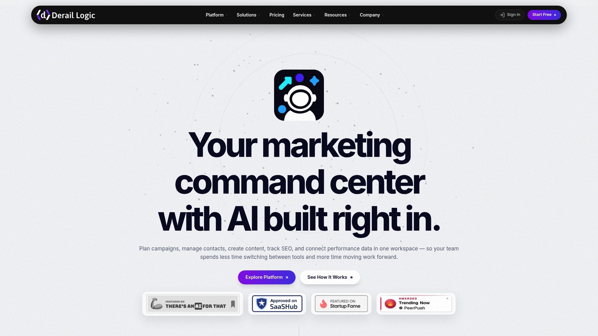
Once you know which fixes matter, building and measuring them shouldn’t require stitching together five separate tools. MartechAI’s landing page builder, visual Campaign Studio, and deep analytics sit in one workspace, so a form change and the campaign that feeds it get tracked together instead of in separate dashboards. If your team is short on engineering time, our website design and development services can build the tested layout for you.
Start on the Free plan to see the analytics in action, or move to Core at $69 per month for the full landing page builder and campaign tracking. Check the pricing page for Growth and Agency tiers if you’re managing forms across multiple clients or brands.

Primary sources and further reading
The rules in this guide draw on Baymard Institute’s checkout research, Nielsen Norman Group’s form design recommendations, Google’s modern-web forms guidance, and Baymard’s form-design best practices. For a critical look at commonly cited multi-step conversion claims, see Black Propeller’s 2026 synthesis. Strong CTA wording is covered further in this partner guide on CTA design.
Sources
- Website Forms Usability: Top 10 Recommendations – NN/g
- Forms guidance — modern-web guidance (GoogleChrome repo)
- Form Design: 6 Best Practices for Better E-Commerce UI – Baymard
- Landing Page Forms in 2026: What the Data Actually Supports – Black Propeller
FAQ
What is the single most effective change to a landing page form?
Removing high-friction fields, especially a password request, tends to produce the largest single improvement, since it directly lowers perceived effort. Pairing that with correct mobile input types and inline validation covers most of the remaining gain.
Should I use a single-step or multi-step form?
Forms with roughly five or more required fields generally benefit from being split into two or three steps with a visible progress indicator. Shorter forms usually perform better left as one continuous step, since splitting adds friction without a clear payoff.
How many fields should a landing page form have?
There’s no fixed number that works for every page, and research on field count suggests it explains less of the conversion difference than which fields you ask for. Keep only what qualifies the lead now and defer the rest to onboarding.
Does page speed really affect form completion?
Yes. Most abandonment happens within the first seconds a page loads, so deferring non-essential scripts and prioritizing the form’s first render tends to matter more than cosmetic design tweaks.
What’s the easiest accessibility fix to start with?
Connecting every label to its input with matching for and id attributes and using a real <form> element are the fastest wins, since they immediately improve screen reader and keyboard navigation with no design change required.