


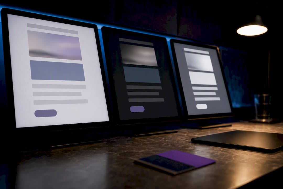
Yes, you need to treat dark mode as mandatory QA for every campaign you send. The top three fixes: declare color-scheme in your head markup, layer in defensive CSS with client-specific patches, and test across a prioritized client matrix before you hit send. Skip the contrast check and you risk invisible logos and unreadable CTAs in half your inbox.
TL;DR:
- Many email clients either ignore, partially invert, or fully invert your dark mode styles, making comprehensive testing essential before sending campaigns.
- Apple Mail requires explicit opt-in with meta tags or CSS declarations for dark mode support, while Gmail’s behavior varies across platforms, necessitating multi-device testing.
- You must layer multiple fixes: CSS media queries, client-specific attribute targeting, inline fallbacks, and proactive logo and button asset management to ensure design survives dark mode transformations.
- Building with midtone palettes and visible borders enhances contrast and brand recognition across inverted color schemes, improving accessibility and consistency.
- Automated tools that simulate forced dark mode during design can catch incompatibilities early, reducing manual QA time and preventing costly post-launch adjustments.
Table of Contents
- What Actually Happens When Dark Mode Email Rendering Kicks In
- Which Email Clients Honor Your Dark CSS and Which Force Their Own
- Building Dark Mode Support for Email Clients Layer by Layer
- Design Rules That Survive a Forced Color Inversion
- How to Test Dark Mode Email Rendering Before You Hit Send
- Getting Contrast Right When Half Your Palette Just Flipped
- Where MartechAI Fits Into Your Dark Mode Workflow
- The Real Problem With Most Dark Mode Advice
- Test Dark Mode Compatibility Before Your Next Send
- Sources
- FAQ
What Actually Happens When Dark Mode Email Rendering Kicks In
Email clients handle dark mode in one of three ways, and the difference determines whether your campaign survives or falls apart. No change means the client renders your email exactly as coded, ignoring the device’s dark setting entirely. Partial invert flips background and text colors selectively, often leaving images and buttons untouched while text areas swap. Full invert runs an algorithmic transform across the entire message, rewriting colors it thinks are “light” into “dark” equivalents, whether or not that’s what you intended.
This isn’t a cosmetic quirk. A logo built as a transparent PNG with black text disappears against a black background the instant a client applies full invert. A call-to-action button styled with a white fill and dark text can end up dark-on-dark, killing the one element you needed the recipient to see. Text overlaid on a photo can lose all contrast if the client inverts the text layer but not the image beneath it.
The core problem for dark mode email design is that these three behaviors aren’t evenly distributed. One client might respect your authored dark styles completely; another ignores them and runs its own transform regardless of what your CSS says. That’s why a single dark-mode snippet copied from a blog post rarely holds up in production. You’re not designing for one rendering engine. You’re designing for a fragmented list of them, each with its own rules.
A few breakage patterns show up often enough to name directly:
- Vanishing logos: transparent-background PNGs with dark or thin strokes disappear when the surrounding canvas flips to black.
- Dead CTAs: buttons with hardcoded white backgrounds and dark text get their background inverted but not always their text, killing contrast.
- Text-on-image failures: captions or headlines baked into a hero image lose all legibility if the client can’t distinguish “text” from “photo.”
- Border and divider loss: light gray hairlines coded at low opacity become invisible against a dark background.
- Inconsistent brand color: a brand’s signature blue can shift hue slightly under some inversion algorithms, weakening recognition.
None of this means dark mode is unmanageable. It means the fix has to be layered, not singular.
Which Email Clients Honor Your Dark CSS and Which Force Their Own
Before writing a line of dark-mode CSS, know which clients will actually read it. Some respect your authored styles as written. Others apply their own transform regardless of your code, and a few sit in between, offering partial hooks you can react to.
Apple Mail is the most standards-friendly major client. It supports prefers-color-scheme and color-scheme, but only after you explicitly opt in with a meta tag or :root { color-scheme: light dark; } declaration. Skip that opt-in and Apple Mail may ignore your dark CSS entirely, according to Courier’s dark mode email primer.
Gmail behaves differently depending on the platform. Desktop web Gmail often leaves your email body untouched. Android Gmail tends toward partial inversion. iOS Gmail can apply a more aggressive full inversion, according to a technical reference on dark mode CSS for HTML email. That split alone justifies testing Gmail on at least two device types, not one.
Outlook is really several products wearing one name. Desktop Outlook on Windows uses a rendering engine tied to Word and behaves unpredictably with modern CSS. Outlook.com and Outlook mobile apps can expose data-* attributes that store the original color before a rewrite, giving developers a hook to react against, per Microsoft’s own dark mode documentation. Outlook’s web and mobile surfaces frequently retain that original-color data even after applying a forced rewrite, which gives senders a reliable hook for reaction CSS in many Outlook contexts.
Samsung Email and Thunderbird round out the list with more limited, less documented dark-mode behavior. Treat them as lower priority unless your audience data says otherwise.
| Client | Typical behavior | Authored CSS honored? |
|---|---|---|
| Apple Mail | No change (with opt-in) | Yes, after color-scheme opt-in |
| Gmail (desktop web) | No change | Rarely needed |
| Gmail (Android) | Partial invert | Limited, needs patches |
| Gmail (iOS) | Full invert | Limited, needs patches |
| Outlook (desktop) | Varies by version | Inconsistent |
| Outlook (web/mobile) | Forced with data-* hooks |
Reactable via attributes |
| Samsung Email | Partial invert (varies) | Limited |
| Thunderbird | No change (mostly) | Yes, generally |
Prioritize testing in this order: Apple Mail and Gmail first, since they cover the largest share of consumer inboxes, then Outlook variants for B2B-heavy lists, then Samsung Email and Thunderbird as a final pass.
Building Dark Mode Support for Email Clients Layer by Layer
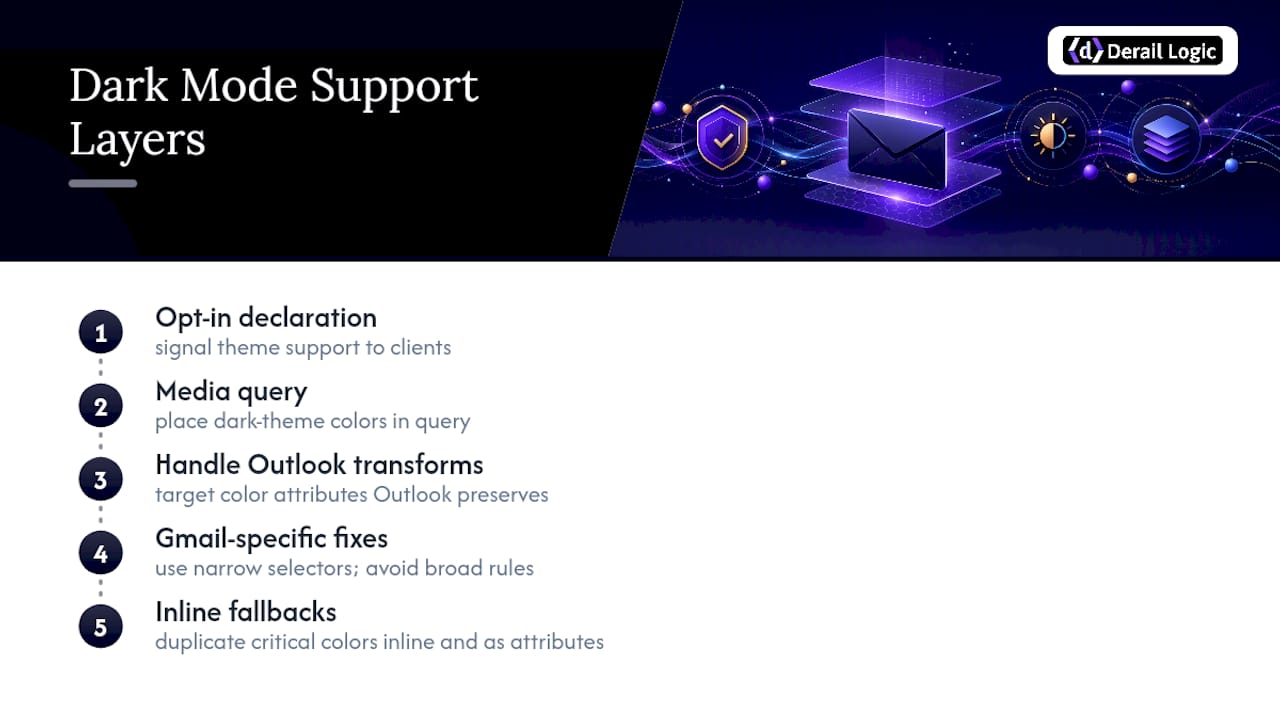
No single tag solves dark mode for email. You need a stack: an opt-in declaration, a media query for standards-friendly clients, targeted selectors for the clients that force their own transform, and inline fallbacks so nothing breaks when a client strips your <style> block entirely.
Step one: opt in explicitly. Apple Mail and other standards-based clients need to know you support both themes before they’ll apply prefers-color-scheme rules:
<meta name="color-scheme" content="light dark">
<meta name="supported-color-schemes" content="light dark">
<style>
  :root {
    color-scheme: light dark;
    supported-color-schemes: light dark;
  }
</style>
Without this block, Apple Mail can ignore your dark-mode CSS outright, per Courier’s implementation guidance. The color-scheme property itself is a standard CSS feature, and MDN’s documentation explains how it signals theme intent to compatible user agents.
Step two: write the media query. This is where your actual dark-theme colors live:
@media (prefers-color-scheme: dark) {
  body, .email-bg {
    background-color: #0e0e0e !important;
    color: #fffffe !important;
  }
  .card {
    background-color: #1c1c1e !important;
    border-color: #3a3a3c !important;
  }
  .btn-primary {
    background-color: #4d8dff !important;
    color: #0e0e0e !important;
  }
}
Note the color choices: #fffffe instead of pure white, #0e0e0e instead of pure black. That small offset matters more than it looks. Standards-friendly clients like Apple Mail read this media query directly. Gmail and some Outlook contexts do not reliably honor it, according to mailmode’s technical breakdown, which is why the next two steps exist.
Step three: handle Outlook’s forced transforms. Since Outlook web and mobile often preserve your original colors in data-* attributes even after a forced rewrite, you can target those attributes directly:
[data-ogsc] .card {
  background-color: #1c1c1e !important;
}
[data-ogsb] {
  background-color: #0e0e0e !important;
}
For desktop Outlook, MSO conditional comments and VML remain the most dependable fallback for structural elements that Outlook’s Word-based engine tends to mangle:
<!--[if mso]>
<v:rect xmlns:v="urn:schemas-microsoft-com:vml" fill="true" stroke="false">
  <v:fill type="tile" color="#0e0e0e" />
</v:rect>
<![endif]-->
Step four: narrow Gmail-specific fixes. Gmail sanitizes a lot of CSS, so broad selectors often get stripped. The u + .body pattern is a pragmatic workaround, but use it sparingly:
u + .body .gmail-dark-fix {
  background-color: #0e0e0e !important;
}
Step five: never skip inline fallbacks. Any client that strips your <style> block still reads inline styles and bgcolor attributes. Duplicate your critical colors as both:
<td bgcolor="#0e0e0e" style="background-color:#0e0e0e;">
This redundancy isn’t sloppy code. It’s insurance against the client sanitizing exactly the rule you needed.
Design Rules That Survive a Forced Color Inversion
Code handles the mechanics. Design decisions determine whether the result still looks like your brand once a client has finished rewriting your colors. The first rule: avoid pure black and pure white. Practitioner guidance from Designmodo’s dark mode email walkthrough recommends midtones and off-whites instead, since pure extremes trigger harsher inversion artifacts and create halation, that glowing blur effect around text on very dark backgrounds.
Logos need their own strategy, since they’re the single most common casualty of forced dark transforms:
- Give logos an opaque background plate, even a subtle one, rather than relying on transparency.
- Keep an outlined version of your logo mark ready for dark backgrounds, especially if your primary logo is a solid dark color.
- Build two logo assets and swap them with a media query rather than hoping one version works everywhere.
- Test the logo specifically against a full-invert simulation, since that’s the scenario most likely to erase it.
Buttons face a related problem. A button styled with a light fill and dark text can survive a partial invert fine, but a full invert might flip the fill dark while the text stays dark too, erasing the contrast that made it clickable. The safer pattern is to declare button colors explicitly inside your dark-mode media query rather than letting the client guess, and to add a visible border around the button so its shape remains legible even if the fill color shifts unexpectedly.
Images carry the same risk as logos. Any critical information, a discount code, a headline, a deadline, baked directly into an image file is invisible to a client that doesn’t render images by default, and it’s just as vulnerable to becoming illegible if the surrounding chrome inverts and the image doesn’t. Keep essential text in live HTML, and reserve images for decorative or supporting visuals.
Pro Tip: Build your dark-mode palette first, then derive your light-mode palette from it, not the other way around. Designers who start light-first tend to pick colors that look fine on white but turn muddy or overly saturated once inverted.
For teams building out brand systems that need to hold up across themes, design guidance from brands built on strict visual identity standards offers a useful parallel: consistency rules that survive a lot of rendering variation.
How to Test Dark Mode Email Rendering Before You Hit Send
Testing dark mode email support requires more than sending a preview to yourself on one phone. Here’s a workflow that catches the failures that matter before your list does.
- Emulate forced dark in Chromium first. Chrome and Edge let you simulate forced dark rendering through developer tools, which catches many of the same issues Gmail Android and some Outlook contexts will apply. This is the fastest early pass, according to Customer, and it costs you nothing but a few minutes.
- Run the live-device checklist in priority order: Apple Mail, Gmail iOS, Gmail Android, Outlook web, Outlook on Windows, Samsung Email, Thunderbird.
- Check contrast in both palettes against a minimum 4.5:1 ratio for body text.
- Verify logo readability specifically under full inversion, not just partial.
- Confirm CTA prominence by checking that the button remains visually distinct from its surroundings in every tested client.
- Look for live, selectable text wherever your design might have defaulted to baking a message into an image.
- Add a visual regression check if your team sends the same template repeatedly, comparing rendered screenshots against a known-good baseline.
- Send to a small human test group on real devices before the full list goes out. Automated emulation catches most issues, but a real inbox on a real phone catches the rest.
The recurring theme across every credible guide on this topic is the same: dark mode is a QA requirement, not a snippet you paste once and forget, according to Courier’s primer on dark mode email design.
Getting Contrast Right When Half Your Palette Just Flipped
Accessibility rules don’t relax just because a client rewrote your colors. The Web Content Accessibility Guidelines framework, and accessibility guidance more broadly, still expect a minimum contrast ratio of 4.5:1 for body text, and that threshold applies in your light palette and your dark palette independently, according to Courier’s dark mode design guidance. A palette that passes in light mode can quietly fail once a client inverts it, especially if your original design relied on a subtle gray-on-white combination that had little margin to begin with.
Dark mode introduces a few accessibility traps that don’t show up in light mode at all:
- Thin font weights that read fine on white can nearly disappear against dark backgrounds; bump up weight for dark-mode text.
- Color-only signals, like a red error state with no icon or label, lose meaning if the red shifts hue under inversion.
- Invisible borders, since a light 1px divider at low opacity can vanish entirely against black.
The fixes are straightforward: build with midtone palettes rather than stark extremes, add visible borders instead of relying on subtle color shifts alone, and use a slightly heavier font weight in your dark-mode media query than you’d default to in light mode. For deeper background on how contrast requirements intersect with broader accessibility and SEO practice, this overview of web accessibility standards is worth a read.
Where MartechAI Fits Into Your Dark Mode Workflow
Testing every template across seven clients by hand is exactly the kind of repetitive check that eats a marketing team’s week. The MartechAI Email Builder folds compatibility checking into the visual editor itself, flagging likely dark-mode conflicts, like low-contrast text or transparent logo assets, as you build, and suggesting fixes instead of leaving you to catch them after send.
That matters because the QA matrix described above only works if someone actually runs it every time. A visual preview paired with automated compatibility checks shortens that cycle from a manual multi-client review to a build-time check, which is where most teams’ dark-mode QA quietly falls apart under deadline pressure.
The Real Problem With Most Dark Mode Advice
Most guides treat dark mode like a checkbox: add one media query, ship it, move on. That advice undersells how fragmented client behavior actually is. Gmail alone splits into three different behaviors depending on platform, and Outlook is really several rendering engines sharing a brand name. Anyone applying a single fix and calling it done is going to get burned by whichever client they didn’t test.
The conventional wisdom also underweights accessibility. Teams obsess over whether their logo survives inversion, and then ship dark-mode text at a contrast ratio that would never pass review in light mode. Dark backgrounds don’t get a pass on WCAG thresholds just because they look moody and premium.
If there’s one thing to prioritize first, it’s the opt-in declaration and the client matrix, not the prettiest palette. A gorgeous dark theme that only renders correctly in Apple Mail is a bigger risk than a plain one that degrades gracefully everywhere. Build defensively, test broadly, and treat every new template the same way, as a fresh QA pass, not a one-time project.
— Zachary
Test Dark Mode Compatibility Before Your Next Send
Derail Logic gives email teams something the manual QA workflow above can’t: a build-time check instead of a send-time scramble. The MartechAI Email Builder previews your template in both light and dark rendering as you design it, flags likely contrast and logo issues automatically, and suggests fixes on the spot instead of after a subscriber reports a broken CTA.
Here’s what that looks like in practice: a visual editor that shows you the dark-mode preview alongside the light one, AI-driven compatibility checks that catch the same failures the client matrix above is built to test for, and auto-fix suggestions that turn a multi-hour QA pass into a few clicks. Pair that with the Marketing Automation platform underneath it, and your dark-mode fixes stay tied to the same campaigns you’re already planning and measuring.
Start a trial and run your next template through an email builder before it goes to your full list.
Sources
- Dark mode email design: a primer for every major email client
- Customer
- Dark mode CSS for HTML email (technical reference)
- MDN: color-scheme
FAQ
How do I turn on dark mode in email?
Dark mode in email clients is controlled by the recipient’s device or app settings, not by the sender. As a developer, you enable your email to support dark mode by adding color-scheme and supported-color-schemes meta tags along with a prefers-color-scheme: dark media query.
How do I get email out of dark mode?
To view an email in light mode regardless of your device theme, most clients, including Gmail and Outlook, offer a per-app or per-message toggle in their display or accessibility settings rather than a sender-side control.
How do I change my email background back to white?
If a specific email’s background looks wrong in dark mode, that’s typically the sender’s code failing to declare explicit background colors on every container; as a recipient, switching your device or app out of dark mode is the only fix, since senders control the code, not viewers.
How do I turn on dark mode in Outlook email?
Dark mode in Outlook is enabled through Outlook’s own display settings on desktop, web, or mobile, not through anything in an individual email. Developers building emails for Outlook should account for data-* attributes that Outlook’s web and mobile surfaces use to store original colors before a forced rewrite.
Do I really need to test dark mode email support separately from light mode?
Yes. Because Apple Mail, Gmail, and Outlook each apply different rendering behavior, ranging from no change to full inversion, a template that looks correct in light mode can fail contrast or hide a logo entirely once a client’s dark transform runs.